Google rolls out redesigned app icons for users worldwide
َIslamabad:Tech giant Google has started rolling out its newly redesigned and more visually distinctive app icons to users worldwide.
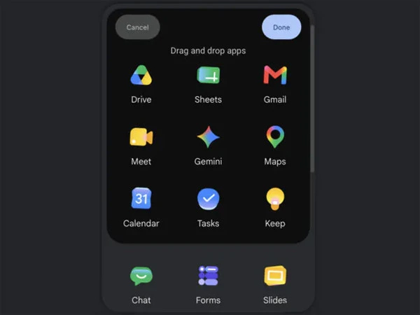
The updated icons were first spotted last month and have since sparked widespread discussion across social media platforms.


With the new design language, Google appears to be moving away from its traditional style. The redesigned icons no longer necessarily feature all four of Google’s signature colors. Instead, several icons now use fewer colors, stronger gradients, and a brighter, more vibrant visual appearance.
User reaction to the changes has been mixed. Some users have criticized the redesign and expressed preference for the older look, while others welcomed the shift, saying Google is embracing a more modern and refreshed design style.
Google’s rollout of the updated icons is still ongoing, and it may take some time before the changes become available to all users globally.